ALICE IN WONDERLAND. ONE WILD TEA PARTY
Since this book of fantasy and adventure was first published in 1865, Alice in Wonderland [written by the Reverend Charles Lutwidge Dodgson using the penname Lewis Carroll, with illustrations by John Tenniel] has enchanted generations with a fabulist’s tale that touches deep into the collective dreamscape. Tim Burton, no stranger to creating iconic imagery, observes that “great stories” like Alice “stay around because they tap into things that people aren’t even aware of on a conscious level. There’s definitely something about those images.”
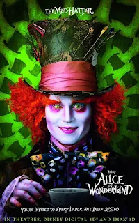
Burton, whose new 3D version arrives in theaters March 5th via Walt Disney Pictures, should know: he lives and works in the London home once owned by Arthur Rackham, the illustrator who created color plates for the book’s 1907 edition. In Burton’s telling (written by The Lion King co-writer Linda Woolverton) Alice is 19 and about to enter into a marriage engagement with a dull, arrogant man. Instead, she follows the White Rabbit down the familiar rabbit hole to Underland (called Wonderland by its inhabitants), a place she visited ten years earlier but does not remember. There, her old friend, the Mad Hatter, convinces her to help overthrow the Red Queen who has taken over Wonderland. In a journey where she grows both large and small, Alice goes on an adventure of self-discovery to save her old friends and the magical place she visited as a child.
Alice, Bigger Than Life
To realize his version of the often bizarre but familiar images in Alice’s world, Burton chose cinematographer Dariusz Wolski, ASC, who had just finished working with the director on Sweeney Todd, The Demon Barber of Fleet Street. Wolski says the film evolved dramatically from its early production plan. “Originally, it was just Alice as a real person,” he explains. “Then Tim added Johnny [Depp] as the Mad Hatter and Helena [Bonham Carter] as the Red Queen. We had a bunch of amazing actors and decided to shoot them for real, against green screen, and create the sets virtually except for the beginning and the end of the film, which are normal live action.”
Because the movie would incorporate so much computer-generated imagery, the decision was made to shoot digitally. While Burton was in London, working on the design of the film, Wolski began testing all the available 3D equipment, including Vince Pace’s 3D Fusion Camera system developed for Avatar.
“We were trying to shoot this film in 50 days, since all we were shooting was the actors on green screen, representing only 30 percent of the movie,” Wolski recalls.
But he and Burton later abandoned the idea of shooting in 3D, in part because it would be “prohibitively expensive.” Wolski also pointed out that if they wanted a Technocrane or a camera on a dolly, he’d be dealing with multiple cameras. “Any time I wanted to change the lens, I’d have to recalibrate,” he says. “Knowing Tim’s temperament - he’s very spontaneous - we were afraid the whole thing would slow down our process.”
Burton had already had a positive experience converting the 2D The Nightmare Before Christmas to 3D in post. “After seeing that conversion job, I found no reason to do it any other way,” Burton says. “Shooting it traditionally gave us more freedom to get into the depth, the layers, that we wanted in the time we were dealing with. We were trying to do it faster…and I didn’t see any difference in quality.” [Alice in Wonderland’s 3D conversion was done by Sony Imageworks, which also oversaw VFX, supervised by Ken Ralston. The project underwent two digital intermediates, supervised by Burton and Wolski, at Company 3 in Santa Monica. Colorist Stefan Sonnenfeld graded the 2D version, and then after the 2D-to-3D conversion, colorist Siggy Ferstl did final tweaks to the 3D version.]
Even though he wouldn’t be shooting in 3D, Wolski did take the time to educate himself thoroughly about 3D so that the end result of the 2D-to-3D conversion would work well. “Shooting all those 3D tests taught us a lot,” the cinematographer says. “It taught us about convergence, what lenses to use, how to frame the shot, and at what points 3D is effective and not. We always kept in mind we were shooting a 3D film.”
Wolski recounts studying a National Geographic movie shot in 3D: “There was a lion, shot with a long lens, and it looked really fake,” he begins. “The perspective is compressed. So, to be safe, I felt it was best to shoot [Alice] on the wider side. An understanding of convergence when you’re creating a composition - in other words, keeping in mind what will be in the foreground and the background - really helped.”
Ultimately, Wolski says he chose “fairly standard” lenses. “The 75mm was the longest lens we used, except perhaps for some effects shots, when the White Queen was looking through her binoculars, ” he adds. “Otherwise, it was 50mm, 24mm, 17mm.”
Choosing the camera was trickier. “I was toying between the Sony F23 - because the F35 wasn’t yet available - and the Panavision Genesis,” Wolski continues. “The F23 is a great camera, but I had a problem, because of the size of the chip, where wide shots were not very sharp. Since the actors were always against green screen, I often had the problem of not enough resolution.” He analyzed capture from both cameras more closely at Sony Imageworks, preferring the Genesis in the head-to-head comparison.
But given the desire for “even more resolution,” Wolski also chose the now-defunct 4K-chipped Dalsa Origin for multiple-character scenes where one character either shrinks or expands in size. All the digitally captured material in the film was laid down on Codex Digital disk recorders, which record 10-bit RGB 4:4:4. Wolski notes that he only created one LUT. “What I have found with digital technology is that it’s so overwhelming and there are so many possibilities of tweaking the camera that you can get completely lost,” he describes. “I gave myself one LUT and kept everything simple, not too contrasty, not too flat, and then did everything with lighting. Otherwise, you’re chasing your own tail.”
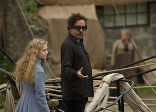
DP Dariusz Wolski, ASC and Director Tim Burton
The cinematographer kept those lighting choices fluid to match the workflow.
“My approach was to be able to move fast and give actors and myself the freedom of changing the mood very quickly,” Wolski continues. The task was to light three 150-by-80-foot green screen stages, differentiated only by topography, such as a castle or hills, which would be transformed into every different indoor and outdoor setting in the film via visual effects. “The most challenging thing was imagining the scene being surrounded by green screen,” he remembers. “You’re dealing with requirements you have to meet to pull the proper mattes and at the same time trying to create a mood.”
The solution was to only have as much green showing as necessary. In addition to a set of black curtains that were repositioned around the stages, Wolski also found light and dark gray fabrics that he placed on the floor to eliminate green spill and also avoid any green bounce. “When you want to put part of the face in shadow, if you’re surrounded by green, the shadow becomes green,” he explains. “Using this gray fabric was one approach we developed that became pretty successful.”
The Alice team (which included A-camera operator Martin Schaer, Steadicam and B-camera operator Scott Sakamoto, additional camera operator Kirby Washington, Libra head operator John Bonnin, D.I.T.’s David Canning and Ryan Nguyen) also used a big silk that doubled as a way for the Sony Imageworks crew to collect data on the relationships of characters to the space.
“We created tracking marks on the silk that gave them a reference,” Wolski shares. They also placed 20K Fresnels on scissor lifts. “If it was an overcast day, we’d just use the top silk, and for a sunset glow, we shot the 20Ks through different kinds of diffusion. That gave me basically every possibility we’d have if we had shot outside.”
For the scenes when the JubJub, a large bird attacks Alice, the crew built a 16-foot diameter black circle and placed it on the crane. “When the bird attacked Alice or interacted with the actors, we had a big shadow we would drive over the faces,” Wolski says. “We tried to create as much interactive lighting as possible.” But going too far with lighting, which could have negatively impacted the work of the visual effects team, was a danger. “There was a constant dialogue between myself and the VFX supervisor Ken Ralston,” Wolski relates. “How much we would do the shadow, where the monster was coming from, where there would be flames. Problems disappear and new ones arise on the set, and, together, [Ken and I] could always find a solution.”
That fluidity extended to the production design, by Robert Stromberg, and the art direction, supervised by Stefan Dechant. “There was a lot of pre-visualization and rendering,” Wolski adds. “But once you come on stage, hardly any of that is there, so you have the freedom of changing it. [Previs] is a luxury that can also become a trap.”
So does Alice re-imagine the century-old iconic images or create something entirely new? A little of both, according to Wolski, who says, “there were so many references in the movie to the old illustrations and other elements. But it’s Tim Burton’s film and ultimately it’s going to be his interpretation.”
And that means a journey through Alice’s timeless and iconic world reflective of the filmmaker’s unique sensibilities. “Those characters are in our dreams, our tales,” Burton concludes. “[But] what I like about [this version of the story] is that it’s more of a personal journey: the moment where you make that important choice. It’s reconciling within yourself who you are, becoming the person you’re going to be, a human being.”
Courtesy of ICG Magazine /Debra Kaufman


